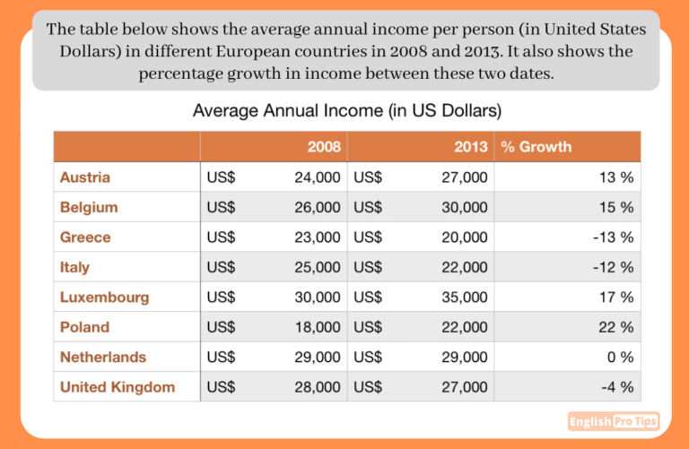
The table gives the mean income in the US $, of every person per year in eight different countries in Europe (Austria, Belgium, Greece, Italy, Luxembourg, Poland, Netherlands, United Kingdom), in the years 2008 and 2013.
Overall, in 2008 and 2013, for all the eight European countries under discussion, the most significant growth was observed in Poland by 22%. Austria and Greece had been equally opposite to each other in this regard where 13% growth per person’s annual income was registered for Austria and 13% income shrank for every citizen in Greece. Netherlands did not register any change by showing 0% growth. Luxembourg and Belgium grew by 17% and 15 % respectively whereas Italy and the United Kingdom denoted 12% and 4% drop respectively. The unit of currency used through this calculation was the US$.
Poland represented a remarkable increment in salary growth by each individual of the state: from US$ 18,000 to US$ 22,000, in 2008 and 2013 respectively.
Luxembourg had been next to Poland by making a 17% growth: from US$ 30,000 to US$ 35,000 in 2008 and 2013 respectively.
The third one country in economic upswing was Belgium: grew by 15%, from the US$ 26,000 to the US$ 30,000 in 2008 and 2013 respectively.
Next to Greece, Italy showed a second significant dramatic drop in per person earning per year: from US$ 25,000 to US$ 22,000, in 2008 and 2013 respectively, by -12%.
The United Kingdom, occupied the third position regarding individual income annually which dropped by 4%: from US$ 28,000 to US$ 27,000 in 2008 and 2013 respectively.
In case of Netherlands, it had been steady ( US$ 29,000 to US$ 29,000) throughout during 2008 and 2013 respectively, by showing 0% change in its economy per capita both the years as mentioned above.


Comments
Hi there, you can increase your score by organizing the data better than this. I would also suggest you to avoid the figures in overall and just mention the general trend. Keep it up. Thank you.
Noted!
Thank you so much for your precious feedback.
Ok Thanks a lot, Sasithray Eesan!
I respect your suggestion. Noted.
Very nice writing Shehla! I like your use of “respectively” and using colons and brackets to show the data. You are doing great!
Thanks an awful lot for devoting some of your precious time and having a look at my answer. Please, keep evaluating my work in future, if you have time.
Hey Shehla,
+ You have some great vocabulary in this answer.
+ Lots of good data highlighting the trends.
+ Lots of good linking words.
+ Great to see that you have included all of the countries in your answer.
– You don’t need to write so much data in the overview. You can simply give the general trends. Have a look at this answer (which is a very similar graphic): https://englishprotips.com/lessons/task-1-how-to-get-7/
– Try to group the countries into paragraphs. You can group countries that show a similar trend. E.g. Body paragraph 1: countries that increase in growth, paragraph 2: countries that don’t increase in growth.
Thanks sir, it’s all because of your amazing tutorials.. I am over the moon that in second Practice attempt in Task 1, I could perform better. All the credit goes to your awesome videos and guidelines.
I’m glad they help. You are doing very well!
Watched the video, noted the loopholes.
Thanks once again for the timely guidance.