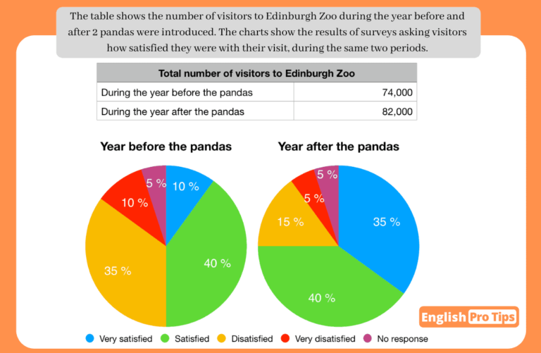
The table compares the quantity of people visiting Edinburgh zoo in two years (before and after two pandas were introduced) and the two pie charts illustrate information on the satisfaction rates of visitors about their trips.
Overall, there was an increase in the number of visitors after the pandas were introduced. The number of people who reported “very satisfied” rose; two categories experienced a decrease: “disatisfied” and “very disatisfied”; two groups remained the same: “satisfied” and “no response”.
There was 74,000 visitors who went to the zoo before having pandas in the zoo. The number registered a significant increase, rising to 82,000 after the pandas were introduced.
Concerning the satisfaction rate, the number of visitors reporting “very satisfied”, which was one-tenth, increased to over a third of population after having pandas in the zoo. By contrast, the number of respondents saying “disatisfied” and “very disatisfied” saw a sizeable decline, reducing by 20% and 5%, respectively. People who reported “satisfied” and “no response” remained constant at two-fifths and 5%, respectively.


 (2 votes, average: 7.50 out of 9)
Comments
Hello Fion
This is a good analysis of the task, very concrete.
Nice one Fion ????
+ Clear introduction
+ Great overview- you cover all of the general trends.
+ Good structure- each paragraph looks at a different graphic.
+ You are able to make good comparisons of the data with useful linking words like “By contrast”
+ Good vocabulary: sizeable decline, remain constant, two-fifths, reported, registered a significant increase
– In my opinion, it is unusual to have a colon after a semicolon: “;two groups remained the same: “satisfied” and “no response”. Maybe you could use brackets here. E.g. “;two groups remained the same (“satisfied” and “no response”)
If this feedback helped you, please take the time to give other members some feedback on their writing- they will definitely appreciate it! ????